INVESTMENT ADVISOR OFFER PAGE
Improve the user experience for the MagnifyMoney Investment Product when the user is looking for an advisor.
The original design issue
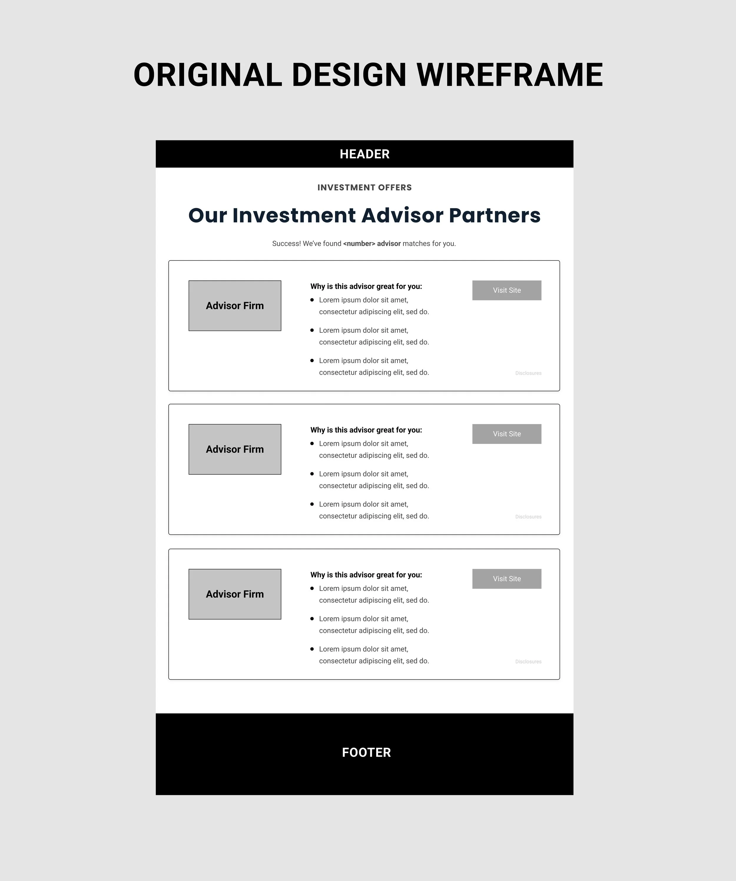
MagnifyMoney was acquired by LendingTree in 2017. This was a chance for LendingTree to start making changes on making improvements to the Investment Product. The image on the left is a wireframe of the original layout design of the Advisor Offers. When the user is on the MagnifyMoney website and looking for a financial advisor, they will have to go through a form flow. After user finishes the form, the user will be sent to the offers page of advisors. The advisors would be just the investment firm/bank and it would list out how this firm/bank would be a right fit for you. If the user chooses to go with a firm/bank that is right for him/her, the user would click on the “Visit Site” CTA and would be taken to that firm/bank’s website.
The issue, is with all the effort the user did to fill out a form flow, he/she will have to go through more effort to go the the firm/bank’s site for more information to get in contact with someone.
The new user experience
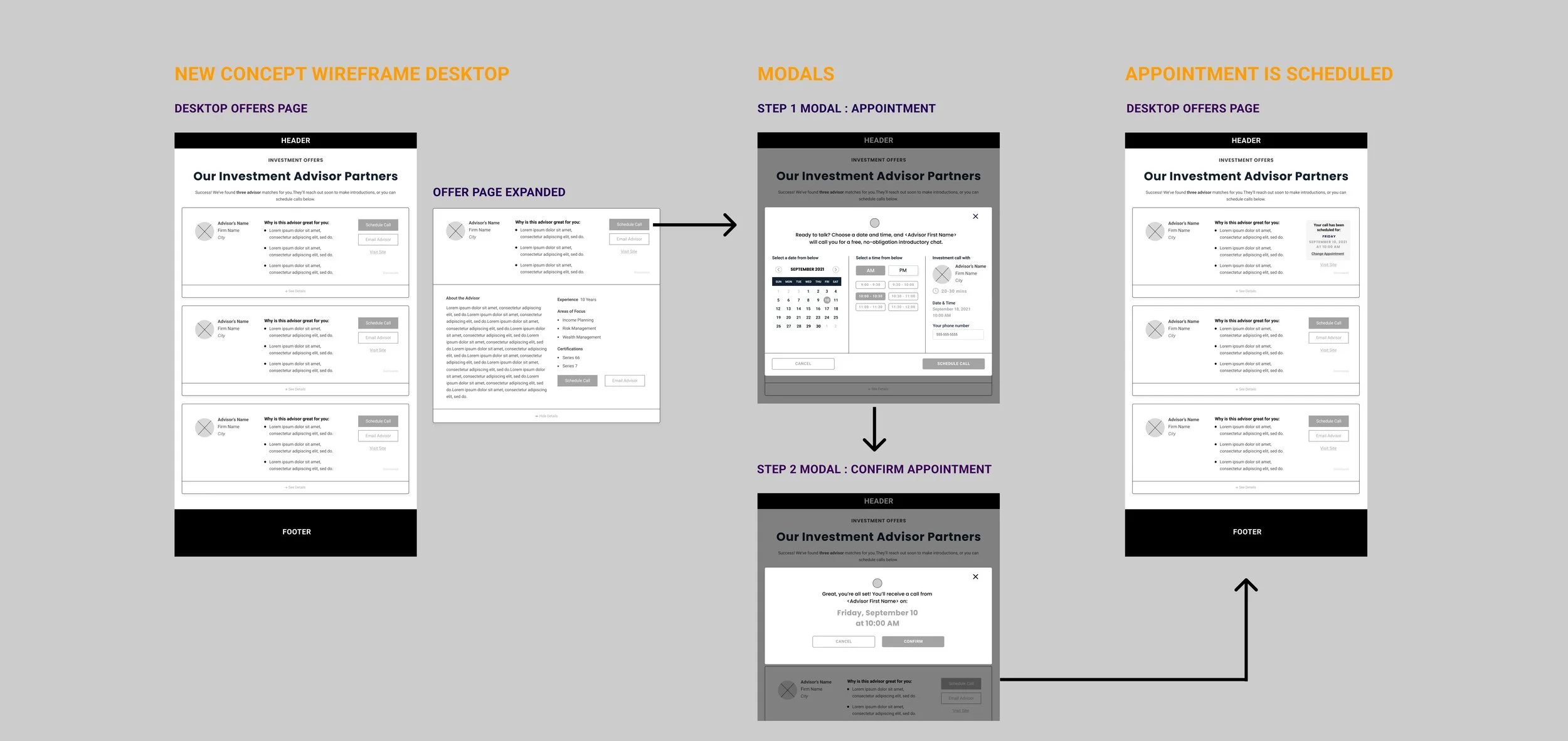
Collaborating with the product manager for the Investment Product, we brainstorm together on coming up with a better user experience for the user to get a better way in to get in contact with an investment advisor or bank/firm. Then we finally came up with a solution solution. On the new offer page design, make the experience where the user can make a phone call appointment with real advisor they like. Not only they can make an appointment with one advisor, but can make phone call appointments with other advisors on the offers page as well. So I wireframe the new offers page and prototype the the flow of the user making an appointment. The image below is a rough draft of the wireframes and flow on making an appointment with the advisor.
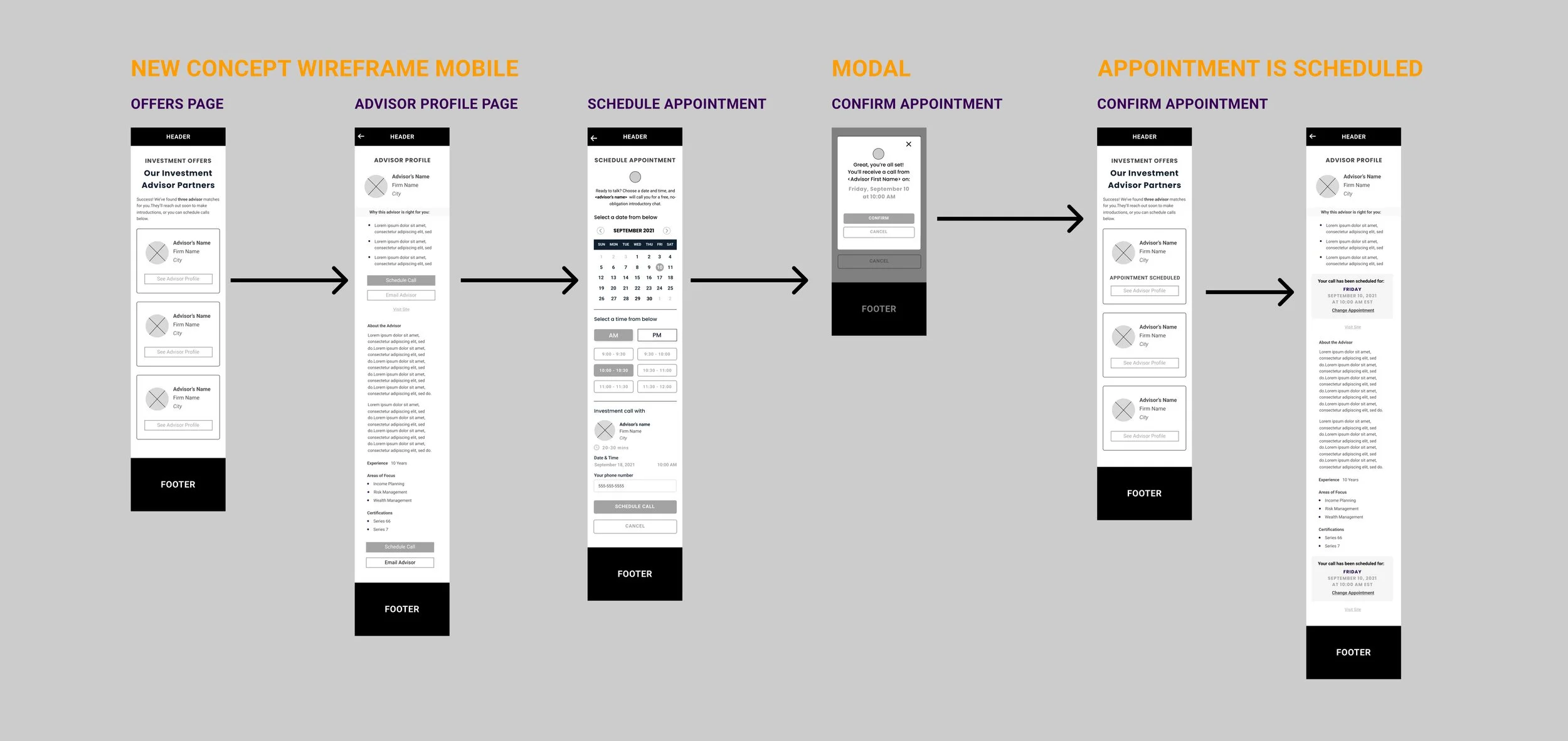
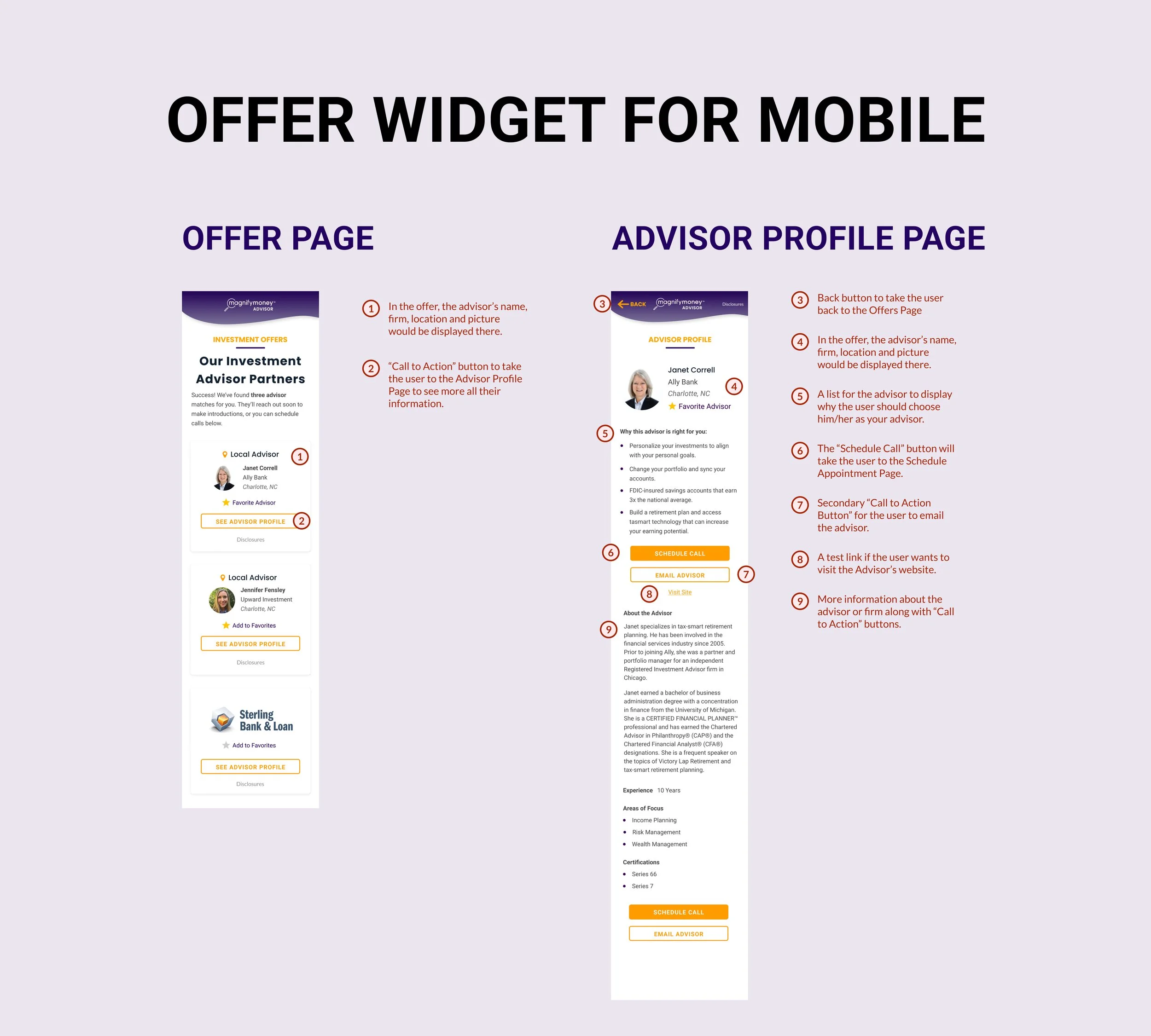
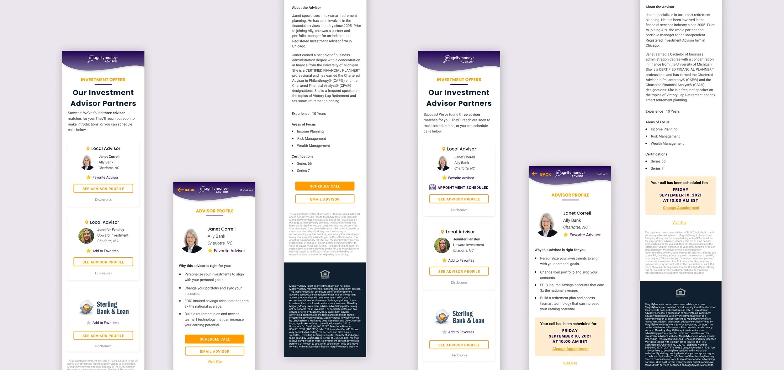
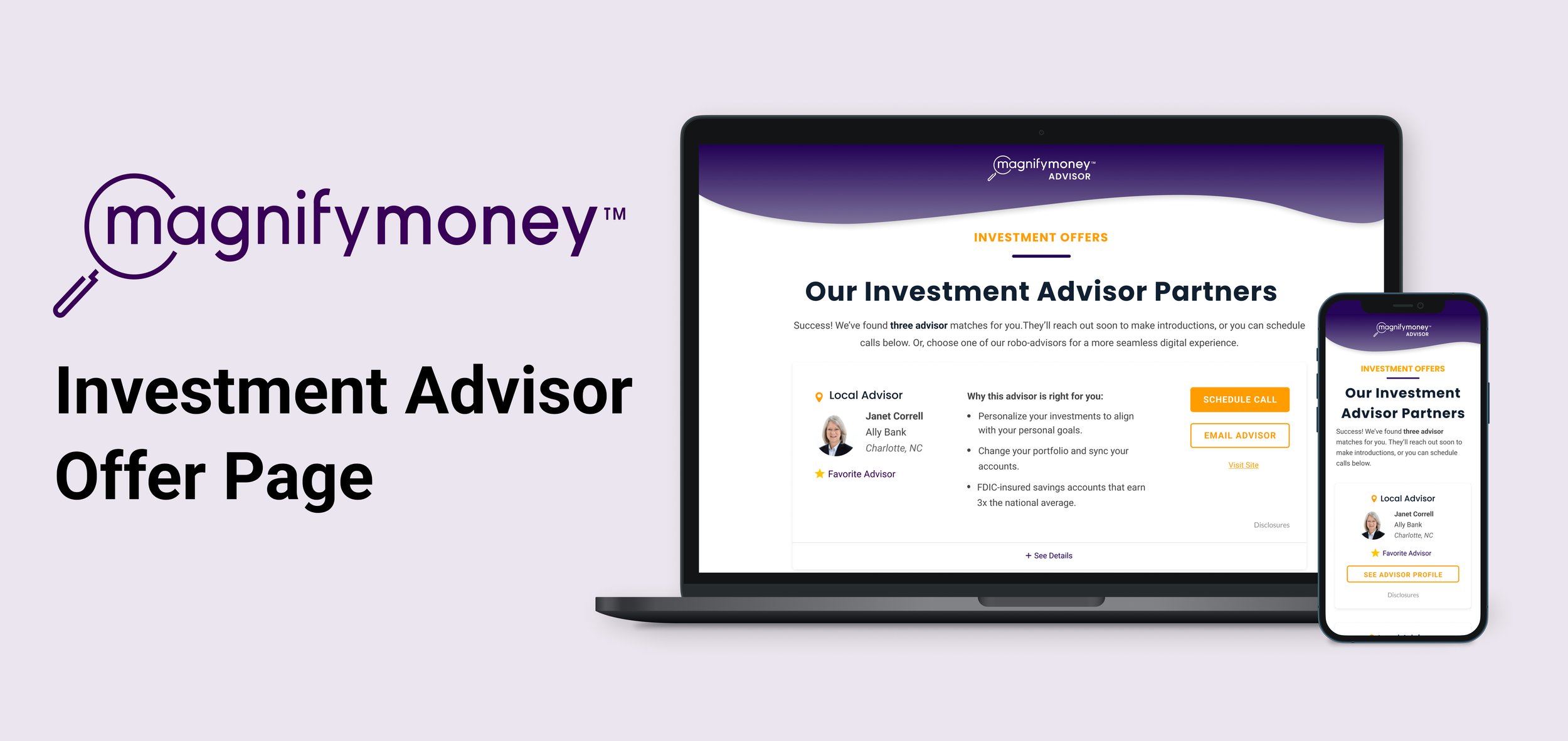
For the mobile experience, it needed to be done differently. Since there will be so much copy content on an offer widget, it will cause a lot of scrolling and it will take awhile to scroll down to the next offer. To handle the approach I make the offers page just display the list of advisors with CTAs to click on their profile page. On the profile page the user can be able to view all the information there and click on the CTA button to take the user to Schedule Appointment Page. The appointment scheduling cannot be done in mobile format because scrolling on a lengthy modal would not be feasible.
Breakdown of the new design
After getting approval with the product manager, creative manager, and front end developer on the direction of the user experience shown on the wireframes, I moved forward on refining the designs assets.
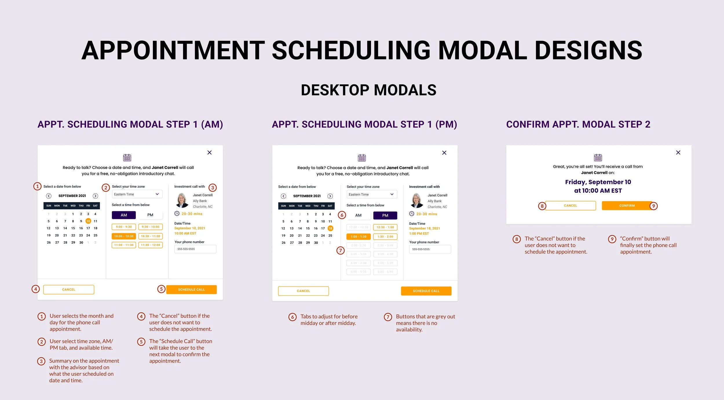
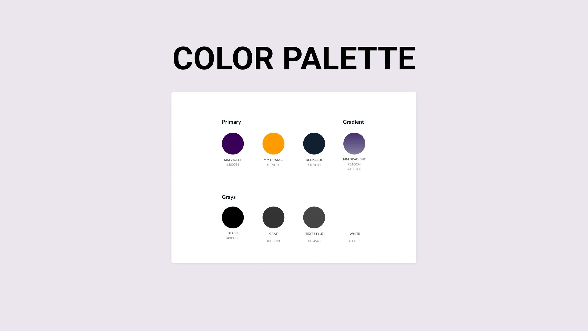
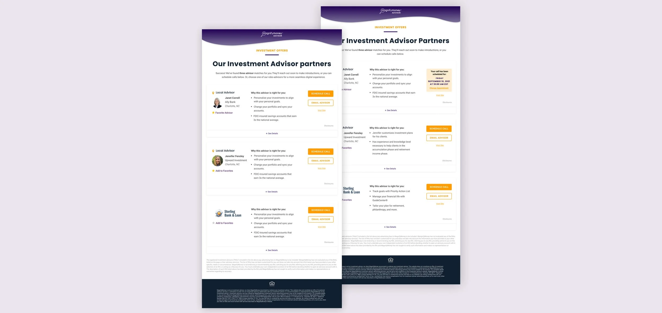
The final look
After showing the final design to the product manager and creative manager for approval, I uploaded the files to Zeplin. From there, those files in Zeplin would be handed to the front end developer to code code up the pages.
The outcome
The product manager for investment loved how this project turn out. He was impressed on how I prototype the user experience and showed him out the scheduling an appointment works. The product manager is very eager to test out the new user experience on scheduling with an advisor in Q3 of 2022. You can view a quick video walkthrough of the appointment scheduling process I prototyped together below.

